
By far one of our more intricate projects and our longest standing client. Boston Doughnuts originally started when Marwa (owner) wanted to transition from Marwa’s Cupcakery to selling the one dessert she knew her customers would love, donuts. We began by creating some logos initially since Boston was still a new born. With no real funding behind the idea, it was basically a “pretty logo” to get the ball rolling. Soon after, we began creating content for her. The new style of content (using a proper camera) contrasting against her phone content gave customers an indication that her products were going to be a level above the rest of the competition.
We created an expectation for her customers. We didn’t know it at the time but we also set the standard for what small businesses need to do in order to get out of their home. Logos aren’t enough, cute ribbons over a plane white box isnt going to wow your customers. They need to be drooling over your content, they need to be invested before they’ve event experienced the product. How can someone get a small business’s product to their families house as a gift when the business doesn’t present itself as gift worthy? Bit harsh, but reality is so. It only took 1 year or so of hard work until Boston was able to move production out of their house and into a “shop” location.
Level 2 of Boston in their “shop”. I have shop in quotation marks because the shop was actually a carwash. And I want to point it out because life doesn’t need to be perfect in order for you to make moves. But thats where they were and then things started to get serious. Now the expectation was higher, custom packaging, the experience of having the donuts there on the shelf and having the signage put up. Everything needed to satisfy the customer. It didn’t last long before having to get to the next level.
Level 3, Boston gets their first actual shop. Moving into Basshill plaza basically increased the standard they worked at. But it was at a more comfortable pace since everything was where it needed to be. Nothing changed from a design or content perspective, but the brand did get better. How? The brand is what people thought of Boston Doughnuts, and if they’re now in a busy shopping centre presenting their artistic donuts everyday without fail, then they’ve basically told their customers they’re here for good.
The Rebrand.
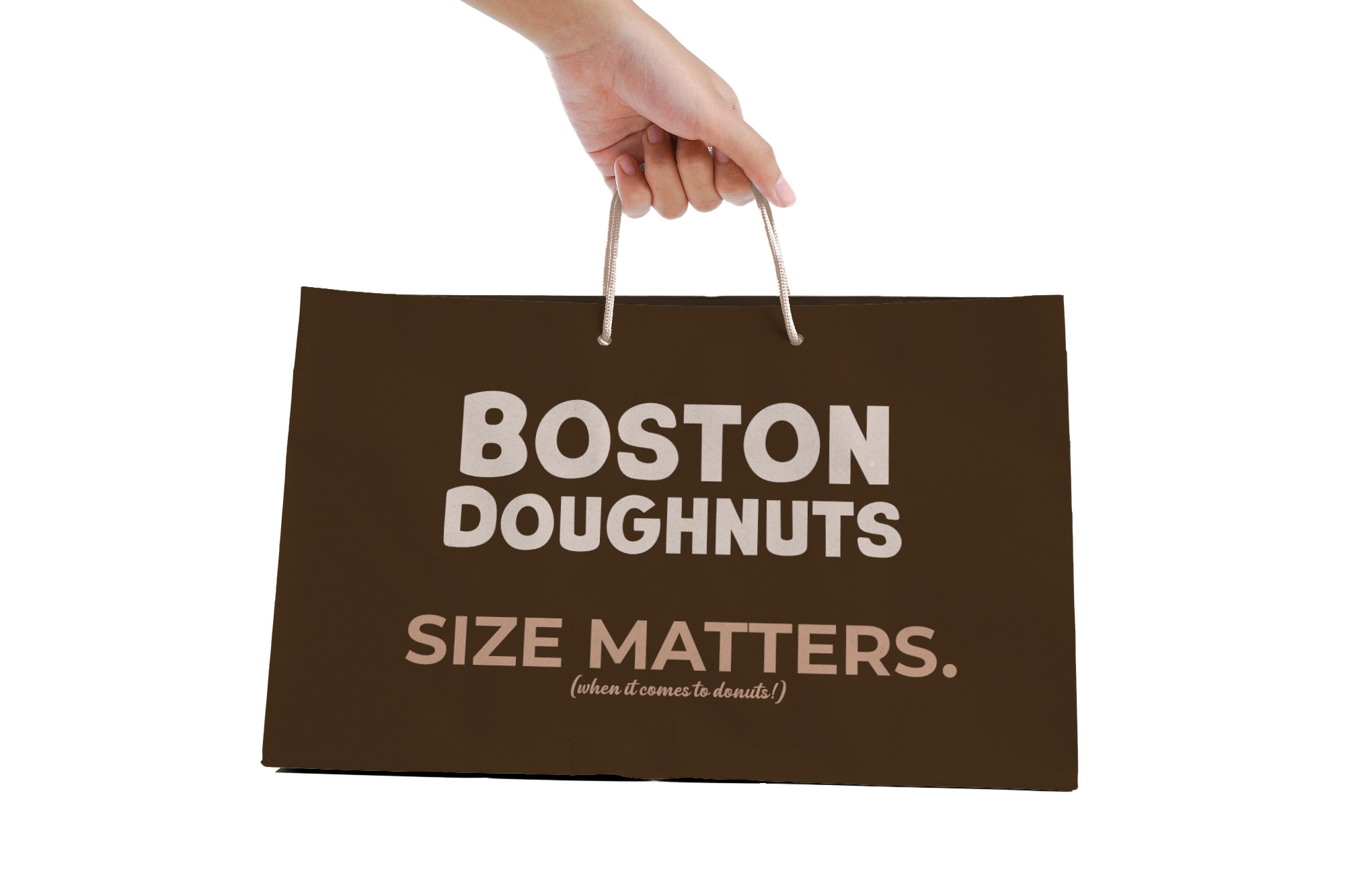
Boston Doughnuts wanted to maintain their beauty (product wise) but create a brand image that also represented it. There were plans to expand, and to get to level 7 (we’re still at level 3). But thats what needs to happen, planning. So to not make any mistakes we needed to know what was going to happen visually in order to satisfy what Boston needed to achieve in order for their brand to remain as good as it was. So the new logo was born, and with it came the packaging, the menu design, all marketing displays, the trays, the displays, and so on. There are lots of things to come. The rebrand is basically visual, the expectations of what Boston Doughnuts is and what it is to become are going to remain the same. Big donuts, lots of flavour, and beautiful to look at.